Artificial identities · Lyfera · 2026-11-06
What a Crop Lets an Image Say
How framing choices change what readers see, from a wide editorial image to a small screen.
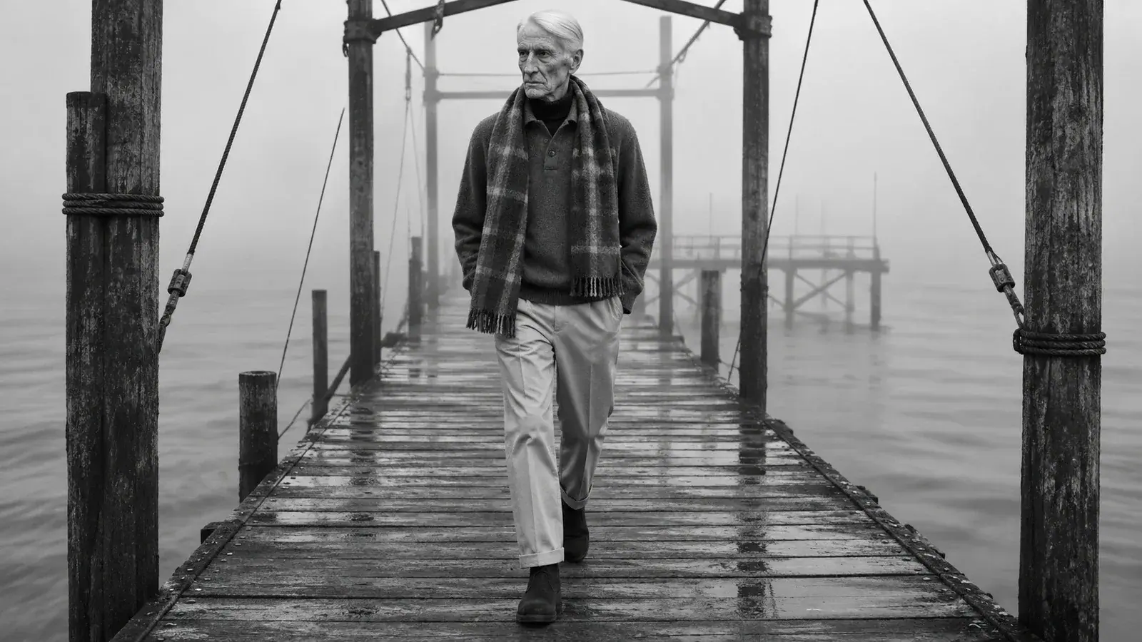
A picture does not arrive on every screen in the same shape. A wide photograph can become a narrow preview; a gesture that mattered at the edge can disappear before a reader ever opens the story. Cropping is a practical decision about attention, but it is also an editorial decision about meaning.
Imagine a portrait of Viktor Weiss on a weathered pier, with open water occupying most of the frame. In a wide image, the distance between the figure and the horizon can make solitude part of the scene. Cut the picture tightly around his face and the same image becomes a portrait about expression. Neither reading is inherently wrong. The important question is which one the story needs.
Decide what must survive
A useful starting point is to describe the relationship that carries the image. It may be a person and a place, a hand and an object, or the distance between two figures. The significant thing is often not a single subject but the space between elements. Marking only a face as the focal point can preserve recognition while losing the reason the photograph was chosen.
For a hypothetical image used beside an article about perspective, the pier and the figure are both necessary. A mobile crop that keeps only the figure may be visually clean but editorially incomplete. A different source frame, with more space around the subject, may work better than trying to rescue the tight composition later.
Make the small frame a separate decision
A desktop image and a phone image can share an identity without being identical. One option is to keep the same photograph and adjust its crop. Another is to choose a different frame from the same creative direction, provided that it does not imply a different event or evidence. In either case, inspect the actual container and its focal point: the visible area depends on both the source image and the way the page displays it.
The web offers explicit ways to serve differently framed images for different displays. MDN's responsive image guide describes this as art direction: a smaller screen can receive a crop chosen for that context. It is a design option, not a promise that every site or image block supports it.
Give identity room to remain recognisable
For an artificial talent, recognisability is more than keeping a face in the centre. Hair, silhouette, wardrobe and the relationship to the setting can all contribute to continuity. If a crop removes the shape of a coat or the posture that makes a character legible, it may preserve pixels while flattening the character.
That does not mean every frame must show everything. A detail can be powerful when it is chosen for a reason: a sleeve against an architectural edge might support a passage about proportion, while the hero establishes the wider scene. The character consistency guide considers identity across images; cropping adds a narrower question about what one version of an image makes visible.
Review the story, not just the file
Test a candidate at its intended display sizes. Ask what a reader sees first, whether the important relationship remains, and whether an accidental cut makes a hand, garment or object hard to understand. Then read it beside the text. A technically tidy crop can still make the wrong sentence feel important.
These are imagined scenes, not records of an event. Their value lies in the choices made around them: what remains visible, what is deliberately left out, and how a human editor brings those decisions into a coherent story.